Appearance
The Importance of Exploratory Data Analysis (EDA) in Machine Learning
by Sanjana Medarametla, on 20/03/2025
Introduction
Before building predictive models, it’s important to really get to know the dataset. This means spotting patterns, catching anomalies, and making sure the data is clean—so our models are as accurate and reliable as possible. That’s where Exploratory Data Analysis (EDA) comes in. It helps us visualize and analyse the data, test assumptions, and figure out which features actually matter.
EDA is all about asking the right questions and filtering out the noise. It helps uncover trends, correlations, and outliers that could impact the model, making sure we’re working with the best possible version of the data.
EDA serves multiple purposes, including:
- Understanding Data Distribution
Visualizations like histograms, box plots, and bar charts help analyze the spread of numerical and categorical variables. They reveal patterns such as skewness, normality, and class imbalances, aiding in better data preprocessing.
- Identifying Missing Values & Outliers
Real-world data is often incomplete or contains extreme values that can impact model performance. Scatter plots, box plots, and heatmaps highlight missing values and extreme data points. These issues can then be addressed through imputation, removal, or transformation to improve model reliability.
- Feature Selection & Engineering
Identifying relationships between variables helps select the most relevant features. Creating new features or transforming existing ones enhances model performance and reduces unnecessary noise.
Steps to perform EDA
Step 1: Import Python Libraries
py
# for data manipulation and numerical calculations
import pandas as pd
import numpy as np
# for data visualizations
import matplotlib.pyplot as plt
import seaborn as sns
# to ignore warnings
import warnings
warnings.filterwarnings('ignore')
Step 2: Load and Inspect the Dataset
py
# loading the data
data = pd.read_csv("train_data.csv")
# get a basic idea of the data
# head() displays the first few rows of the dataset,
# giving a quick overview of the data.
data.head()
# tail() shows the last few rows, helping to
# check recent or end entries.
data.tail()
# info() provides a summary of the dataset,
# including column names, data types
# and missing values.
data.info()
# check for duplication
data.nunique()
data.isnull().sum() # used to get the number of missing records in each column
Step 3: Data Reduction and Feature Selection
In Laptop ID column, there are only IDs and they do not contribute much to the predicting model and hence we can remove it.
py
# Remove Laptop_id column from data
data = data.drop(['Laptop_id'], axis = 1)
data.info()
In machine learning, categorical variables with too many unique values (e.g., product names, laptop models) can be hard to encode.
Removing high-cardinality categorical columns can reduce noise and improve model efficiency.
py
object_columns_to_drop = data.select_dtypes(include='object').columns[
    data.select_dtypes(include='object').nunique() > 5]
Step 4: Statistics Summary and Feature Engineering
py
data.describe().T # Provide a statistics summary
                  # of data belonging to numerical
                  # datatype such as int, float
INFO
Use data.describe(include='all').T for a statistics summary of all data, including object, category etc
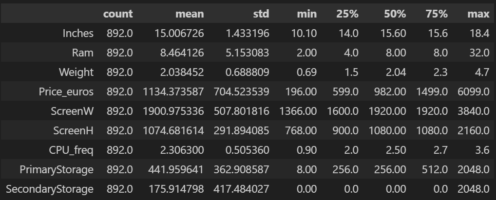
Thus from the data:
- Count: All columns have 892 values, meaning there are no missing values in these numerical features.
- Price_euros has a high mean (~1134.37) but also a large standard deviation (~704.52), indicating a wide range of laptop prices.
- PrimaryStorage & SecondaryStorage show high variation, meaning laptops have diverse storage capacities.
- Price_euros, PrimaryStorage, and SecondaryStorage have a high difference between the 75th percentile and max values, suggesting the presence of outliers.
- Ram has a max of 32GB, significantly higher than its 75th percentile (8GB), indicating some premium models in the dataset.
- Features like Price_euros, PrimaryStorage, and SecondaryStorage could benefit from log transformation to reduce skewness and improve visualization.
py
# numerical columns for log transformation
numerical_cols = data.select_dtypes(include=['float64', 'int64']).columns

# log transformation
df_log_transformed = data.copy()  # Create a copy of the DataFrame
for col in numerical_cols:
    df_log_transformed[col] = np.log1p(data[col])  # np.log1p is log(1+x)
Step 5: Univariate Analysis
Univariate analysis is all about looking at one variable at a time to get a sense of its distribution and patterns. For categorical data, bar charts and pie charts help show how often each category appears. For numerical data, histograms and box plots make it easy to spot trends, outliers, and whether the data is skewed.
py
num_cols = data.select_dtypes(include=np.number).columns.tolist()
for col in num_cols:
    print(col)
    print('Skew :', round(data[col].skew(), 2))
    plt.figure(figsize = (15, 4))
    plt.subplot(1, 2, 1)
    data[col].hist(grid=False)
    plt.ylabel('count')
    plt.subplot(1, 2, 2)
    sns.boxplot(x=data[col])
    plt.show()
Histograms and box plots help visualize the distribution of variables, making it easier to spot patterns like skewness or outliers in the data. 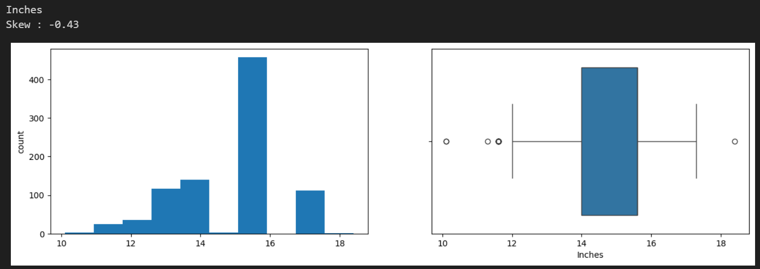
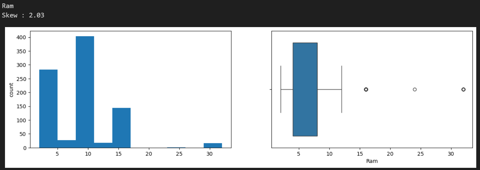
Skewness measures how symmetric or asymmetric a distribution is.
If skewness = 0 → Perfectly symmetric (normal distribution).
If skewness > 0 → Right-skewed (long tail on the right, e.g., prices, salaries).
If skewness < 0 → Left-skewed (long tail on the left, e.g., test scores).
Histogram Analysis (Distribution Shape):
Shows how values are distributed. Helps check normality, skewness, and multimodal patterns.
Boxplot Analysis (Outliers & Spread):
- Box (IQR): Middle 50% of data.
- Line inside box: Median (middle value).
- Whiskers: Spread of data (excluding outliers).
- Dots outside whiskers: Outliers (extreme values).
Step 6: Bivariate Analysis
Helps analyse the relationships between variables, especially how independent variables influence the dependent variable in a dataset.
py
sns.scatterplot(x=data['Ram'], y=data['Price_euros'])
plt.show()
Analysis Type: Scatter Plot, Correlation Heatmap
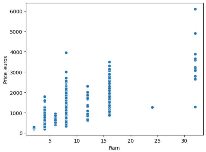
Hence according to the plot, price increases with RAM and also large price variations for the same RAM imply that other factors (CPU, GPU, brand) affect pricing.
py
plt.figure(figsize=(8, 5))
sns.boxplot(x=data['GPU_company'], y=data['Price_euros'])
plt.xticks(rotation=45)  # Rotate labels if needed
plt.title("Laptop Price Distribution by GPU Brand")
plt.show()
Analysis Type: Boxplot – This helps compare the price distribution for different GPU brands.
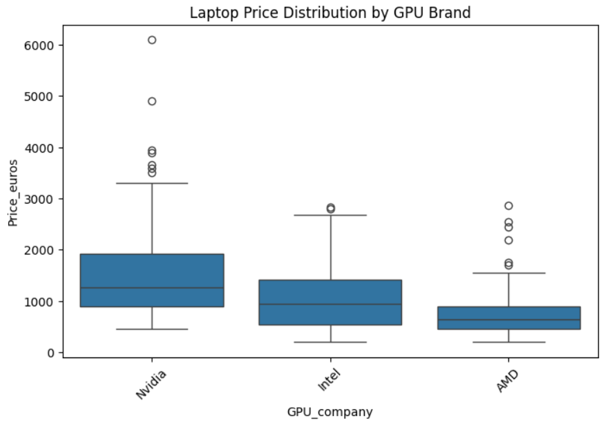
since AMD and Intel GPUs have overlapping price ranges → Other factors contribute to price differences.
Step 7: Multivariate Analysis
Multivariate analysis looks at more than two variables. Multivariate analysis is one of the most useful methods to determine relationships and analyse patterns for any dataset.
py
plt.figure(figsize=(12, 7))
numeric_data = data.select_dtypes(include=['number']) # Keep only numeric columns
sns.heatmap(numeric_data.drop(
    ['Ram', 'Price_euros'], axis=1).corr(),
    annot=True,
    vmin=-1, vmax=1
)
plt.show()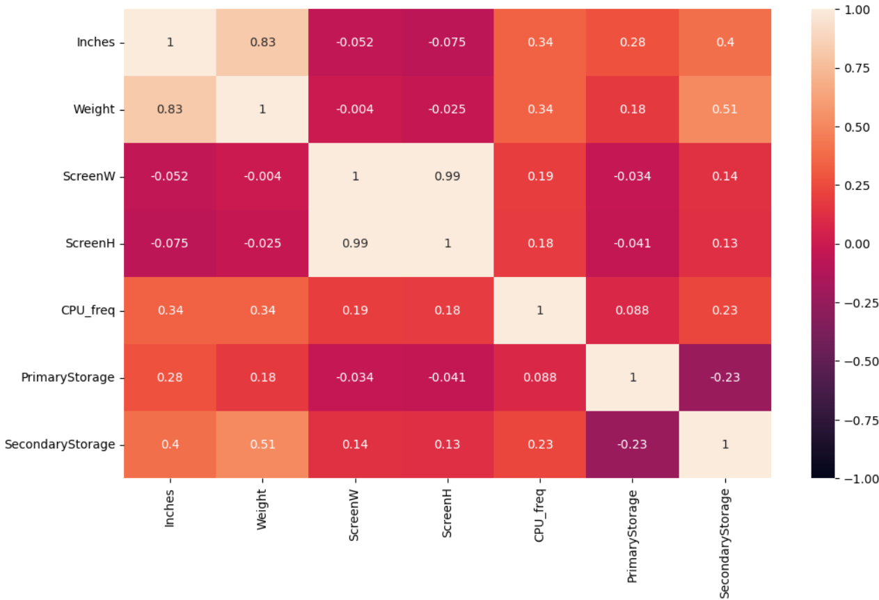
The values in the heatmap range from -1 to +1, where:
- +1 means a strong positive correlation (when one variable increases, the other increases).
- -1 means a strong negative correlation (when one variable increases, the other decreases).
- 0 means no correlation (the variables are independent).
Feature Relationships
- We can identify pairs of features that are highly correlated (e.g., ScreenW and ScreenH might be positively correlated).
- If two features are highly correlated (above 0.8), one may be redundant and could be removed to avoid multicollinearity.
Feature Selection for Modeling
- If a feature is strongly correlated with Price_euros, it may be a good predictor.
- Example: If RAM has a high positive correlation with Price_euros, we should keep it in our model.
Potential Data Issues
- If some variables have unexpectedly high or low correlations, it may suggest data errors or missing values.
- If some variables are strongly correlated with each other but not with Price_euros, they may not be useful for price prediction.
Conclusion
EDA is an essential process in machine learning that ensures data quality and model reliability. By following a structured approach—inspecting data, handling missing values, visualizing distributions, engineering features, and balancing data—we can derive meaningful insights and build robust models.
Citation: Dataset by Muhammet Varlı, Omar Wagih

